
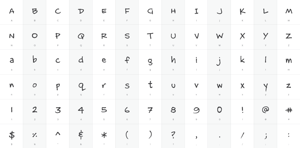
When I was actively drawing my comic m@b (1998-2007), I found the task of lettering my work to be the most difficult. This was mainly due to my process: I pencilled the comic, inked the outlines, erased all pencil markings, inked the smaller details and shading, followed by filling in dark blocks of space. At this point, I would begin the lettering, but my drawing hand would be pretty exhausted; staying neat and consistent with my letters became a real challenge.
In the late-’90s, in my role as a graphic designer, I discovered a ‘fontographer’ named Chank Diesel based in Minneapolis that distributed free fonts. I used so many of the fonts in my professional work that I felt guilty and decided to send him a stack of back issues of my comic. I stumbled upon the idea of creating a font of my own handwriting in 2002 as I began planning to publish a collection of all of my m@b issues into a book because I wanted to correct the few typos and weird letter-spacing that existed in a handful of comics. This would accomplish a few things: I could spell-check my comic, my lettering would consistent, and it would save my hand from this arduous task.
When I approached Chank about my idea he jumped on it. We released it in 2003 when my book, Wide Collar Crimes, was published. In fact, the creation of my font kick-started a campaign by Chank where you could hire him to create a custom font of your handwriting. The MattB font became a popular staple in Chank’s free font section. MattB is currently available for usage in Adobe Fonts.
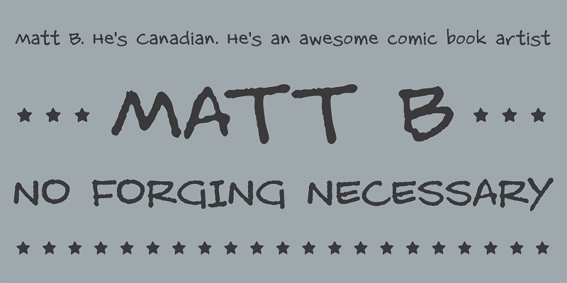
The knock-on effect of my handwriting being available to the public is discovering it’s usage in unexpected places. The first time was the week after I left The Hockey News, art director Jamie Hodgson used the font of the cover of the 2003 Playoff Preview issue. I found in used on loads of websites and the occasional product. And the most recent experience was while watching an episode of NOVA on PBS: Polar Extremes (season 47, episode 1) used my font in numerous graphics over the course of the documentary. Below is the first occasion it’s used. As an avid watcher of this PBS program, I was elated to see my font in usage 20 years after it was created.