Since Matthew’s days as a comic artist, he’s been creating products to support his projects and ventures. Matt made a conscious decision when he started Spacing magazine to utilize merchandise sales as part of the overall business plan. Some of the products he has created over the years haven taken on a life of their own, such as the subway buttons and Pinko buttons, and have become synonymous with Toronto. With the opening of the Spacing Store in 2014, he has continued to design all Spacing-branded products such as notebooks, prints, apparel, hats, and housewares.
BUTTONS
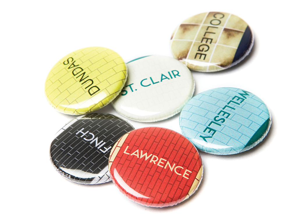
The most important business decision Spacing ever made, outside of launching the magazine, was to lean into the production and sales of merchandise. Instead of plastering the magazine’s logo on a variety of cheap products, Spacing decided to focus on Toronto-centric merchandise, taking inspiration from everyday civic objects like street signs, public art, and subway stations. In the fall of 2004, Matthew designed a series of one-inch buttons that replicated the wall design of every subway station in the city (fridge magnets were released the following year). Within two months of going on sale, over 30,000 buttons were sold. For the next two years, revenue from button sales outpaced both advertising and subscription sales combined. The popularity of the subway buttons continues to endure — after 20 years, over 1 million buttons and magnets have been sold.
READ THE ORAL HISTORY OF THE SUBWAY BUTTONS
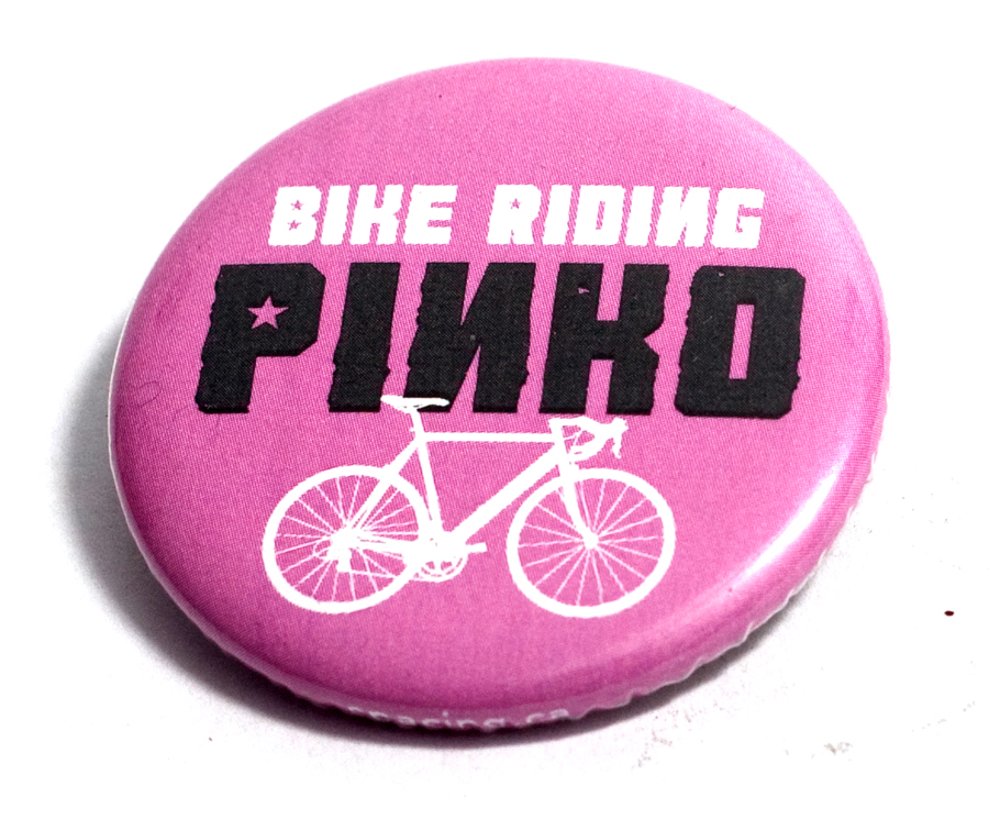
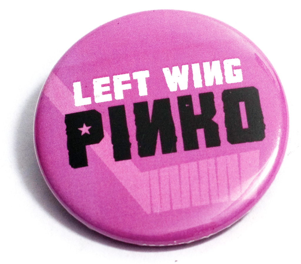
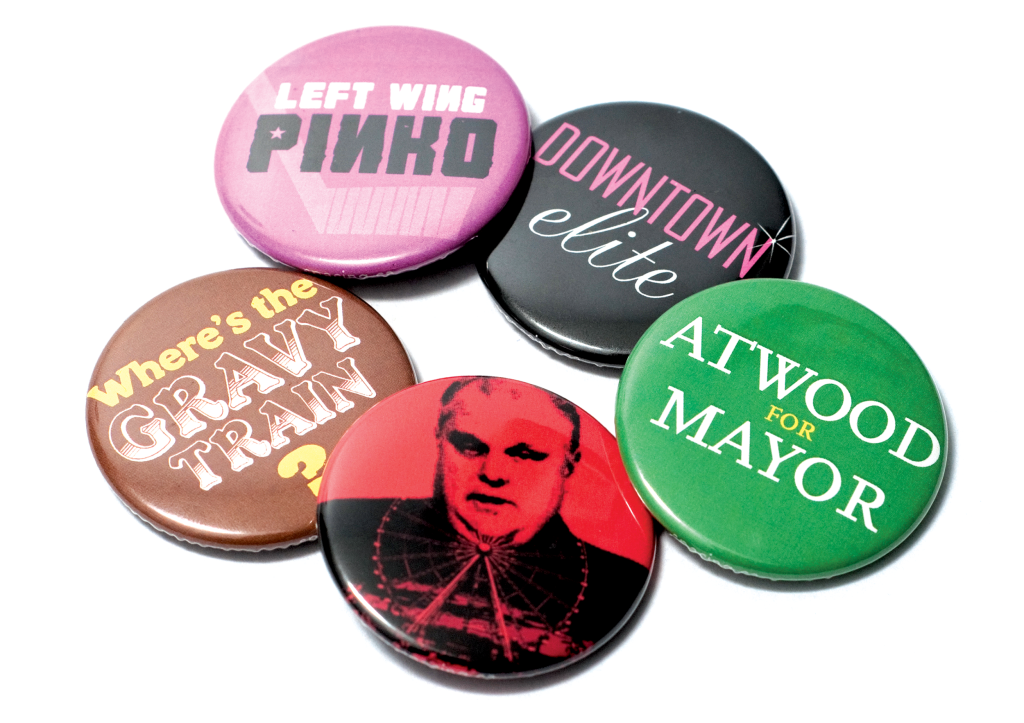
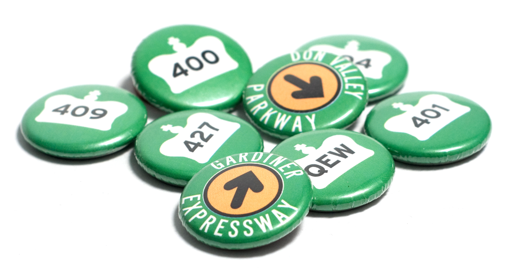
The success of the subway buttons allowed Spacing to launch a number of other of buttons, such as sets of stations from Montreal and Edmonton transit systems, and even a Toronto-area highway series. The next big button craze started by Spacing was in 2010: when Rob Ford was sworn in as mayor at City Hall, hockey commentator and knuckle-dragger Don Cherry made a speech that included lambasting “left wing, bike-riding pinkos”. Matthew immediately designed BIKE RIDING PINKO and LEFT WING PINKO buttons that went on sale within a hour. Over 15,000 were sold within a week, with orders coming from every province in Canada and 20 American states. Rob Ford continued to provide inspiration with his words and antics, thus producing even more political-themed merchandise for Spacing. Over 100,000 Pinko-themed buttons have been sold.
METRO MAGNETS
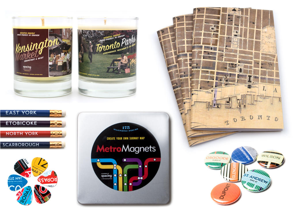
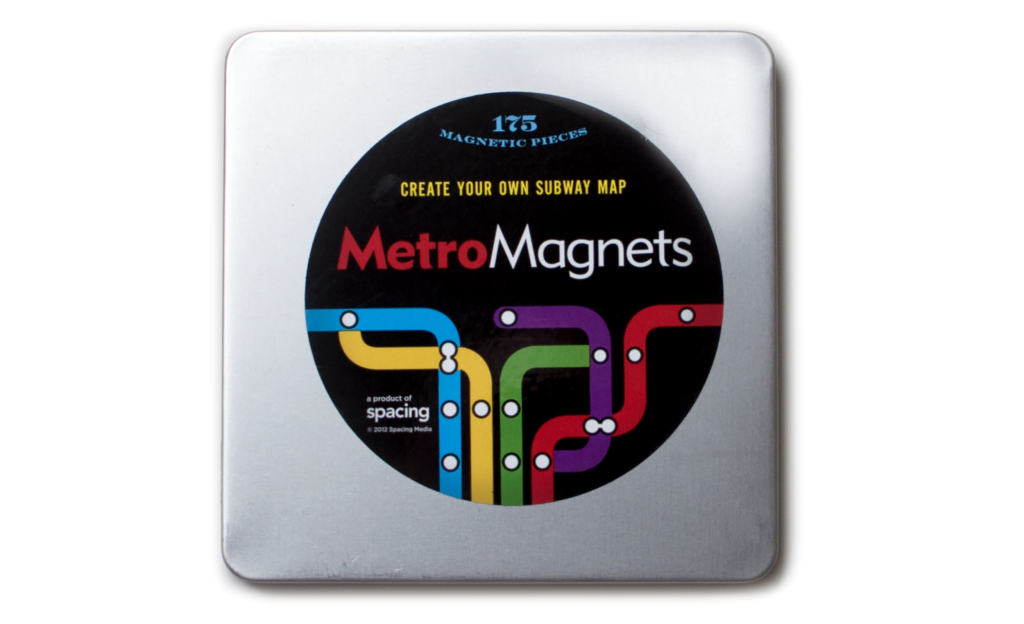
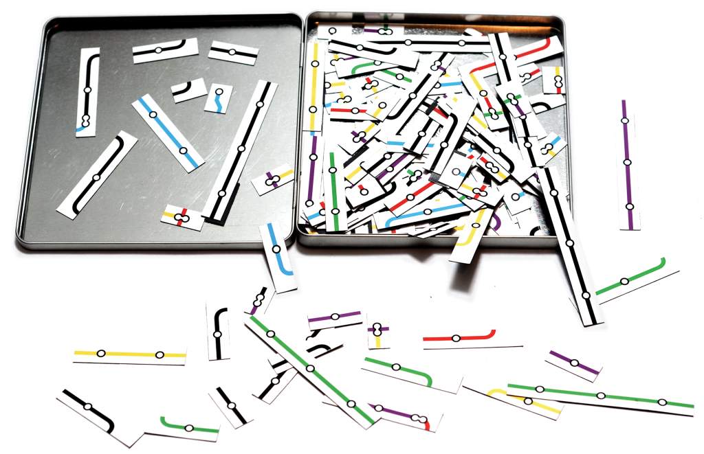
Matthew’s fascination with maps and transit led him to create Metro Magnets, which was inspired by the ever-popular Magnetic Poetry product where people arrange random words into funny poems or phrases on refrigerator doors. Matt played with this concept and replaced the words with different parts of subways lines: various colours, lengths, stations, and shapes allow the user to become a master transit planner and create their own customized subway system map. The product sold very well for Spacing when it was launched in 2013, with almost half of the orders coming from the United States. It continues to this day to be a popular item with transit fans, while teachers and transit planners use it as a tool in the classroom or workplace. Matthew conceptualized the products and executed the branding, design, and packaging. Matthew also conceived the concept for the product’s commercial (watch below) filmed and edited by Sam Javanrouh.
WATCH THE COMMERCIAL
ROCKET WHEEL
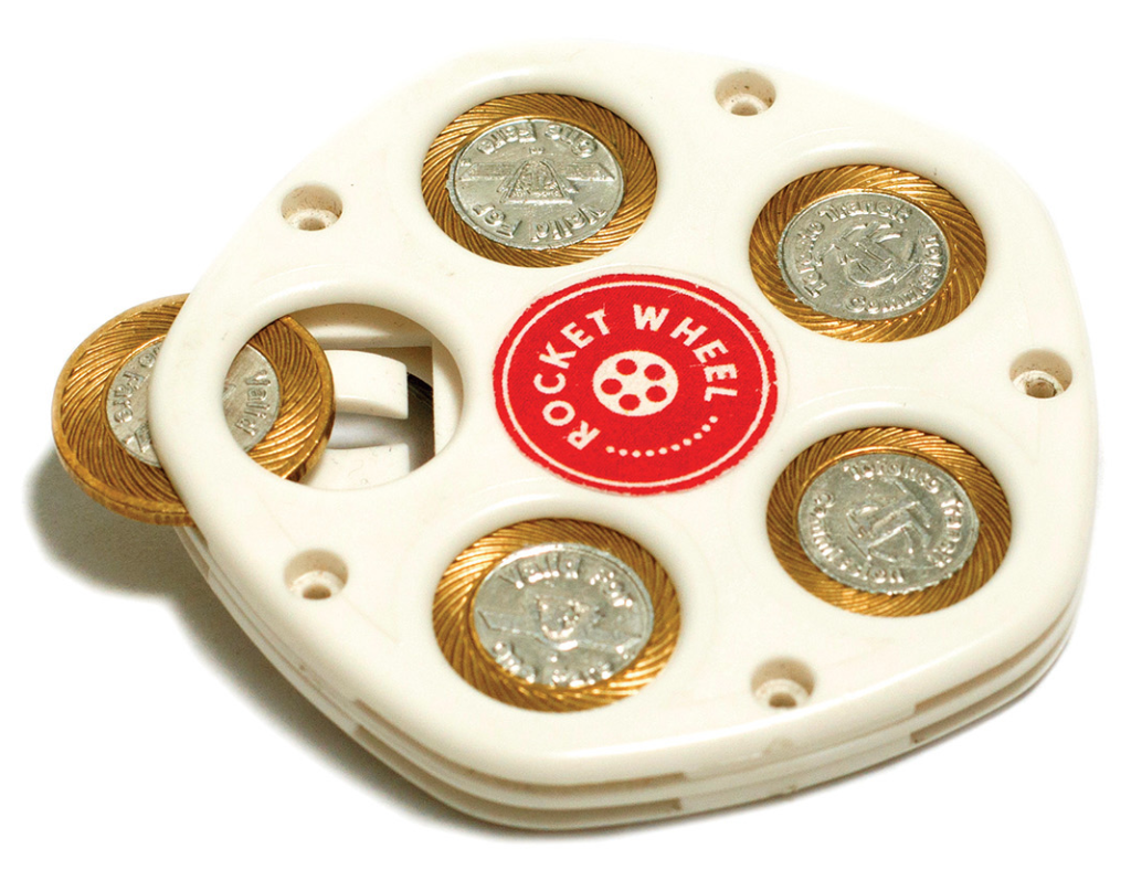
In 2012, Spacing stumbled upon a unsold stash of plastic token holders. Originally used by transit riders in the UK and coincidentally able to carry the same size tokens as the TTC used, Spacing bought the remaining 10,000 units. Matthew developed the marketing campaign and product design, naming it the Rocket Wheel (‘the rocket’ is a longstanding nickname for Toronto’s subway trains). The Rocket Wheel was a top-selling product for three years.
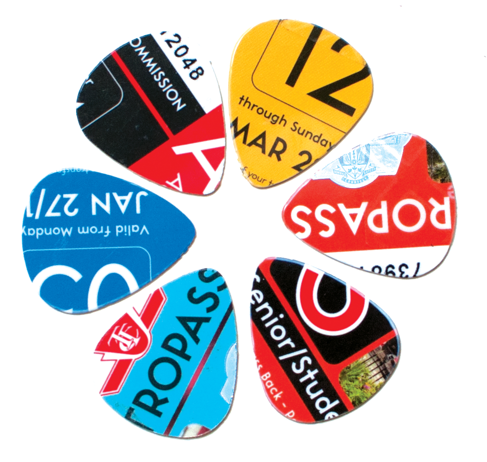
METRO PICKS
In 2016, Matthew approached the TTC about obtaining the transit agency’s unsold monthly cards, known as the Meteopass. The Spacing Store up-cycled the plastic cards into guitar picks using a hand-held device that cuts objects into the shape of a pick. This innovative and creative approach to merchandising has been a hallmark of Matthew’s career.
HOUSEWARES + STATIONARY
Matthew has developed and designed an assortment of houseware and stationary products. Items take inspiration from different landmarks and design elements that help define Toronto.
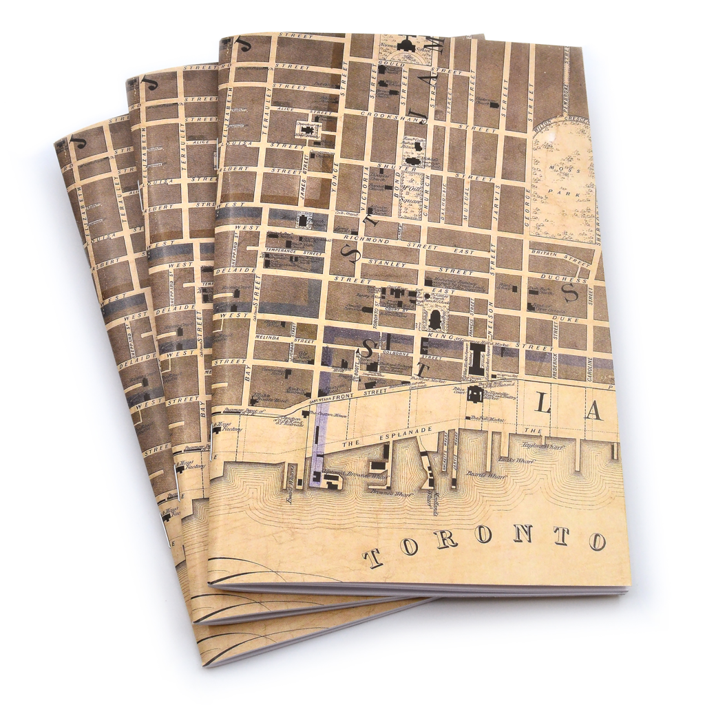
A blank notebook using a vintage map of Toronto from the 1890s
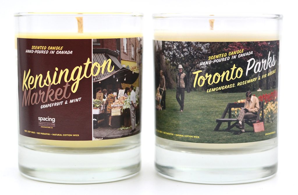
Scented Candles
The packaging is inspired by Toronto neighbourhoods and uses Toronto Archives photos
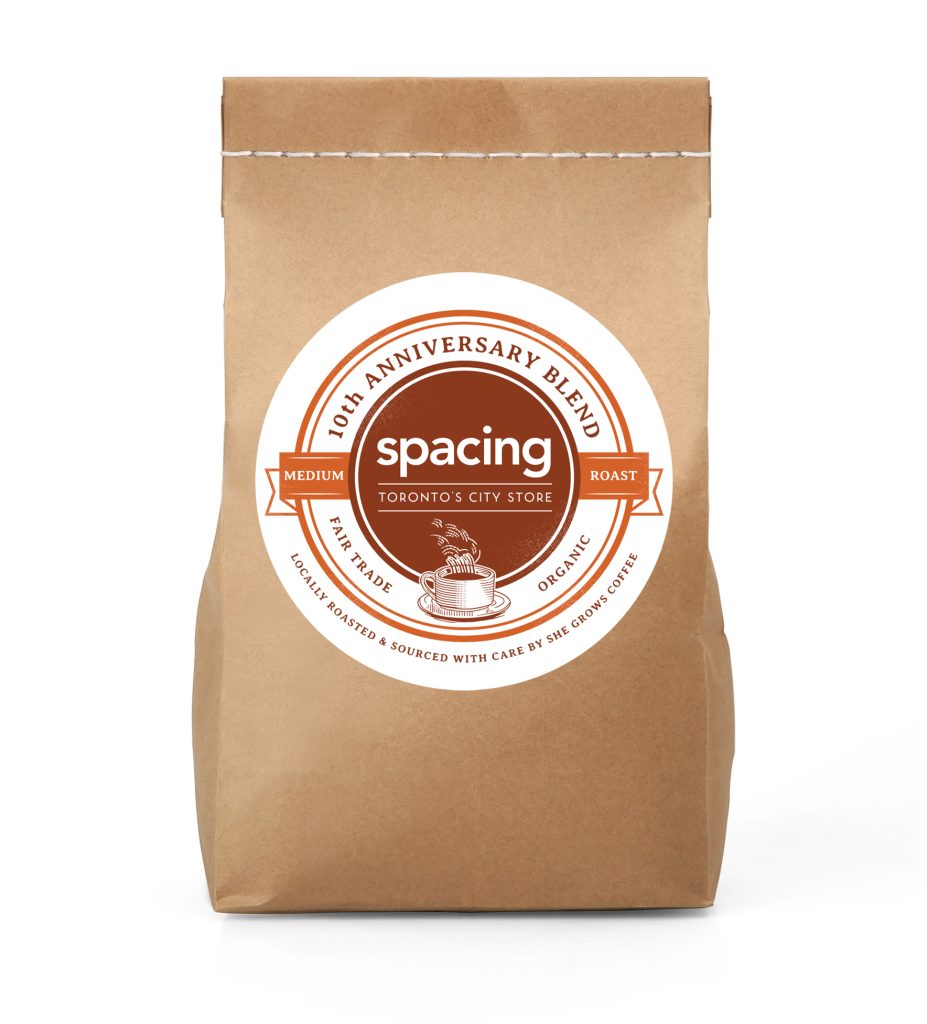
LEFT: Spacing-branded coffee to celebrate the store’s 10th anniversary
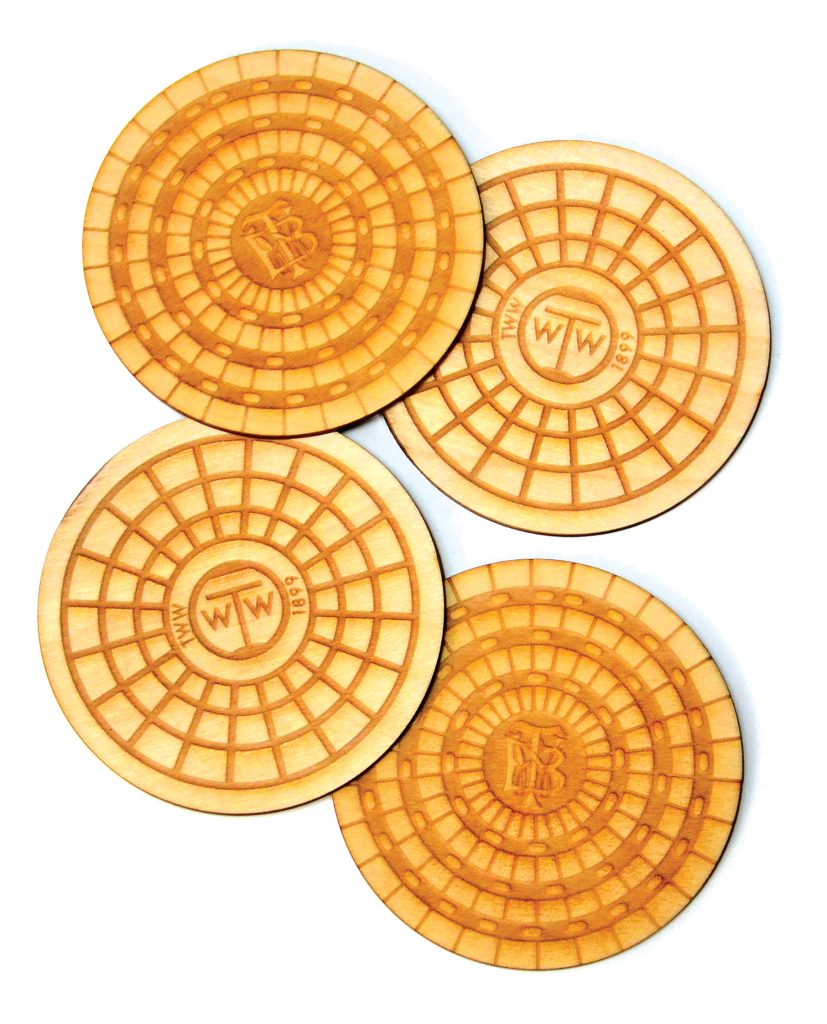
RIGHT: Wood-engraved coasters replicating vintage Toronto sewer cover designs
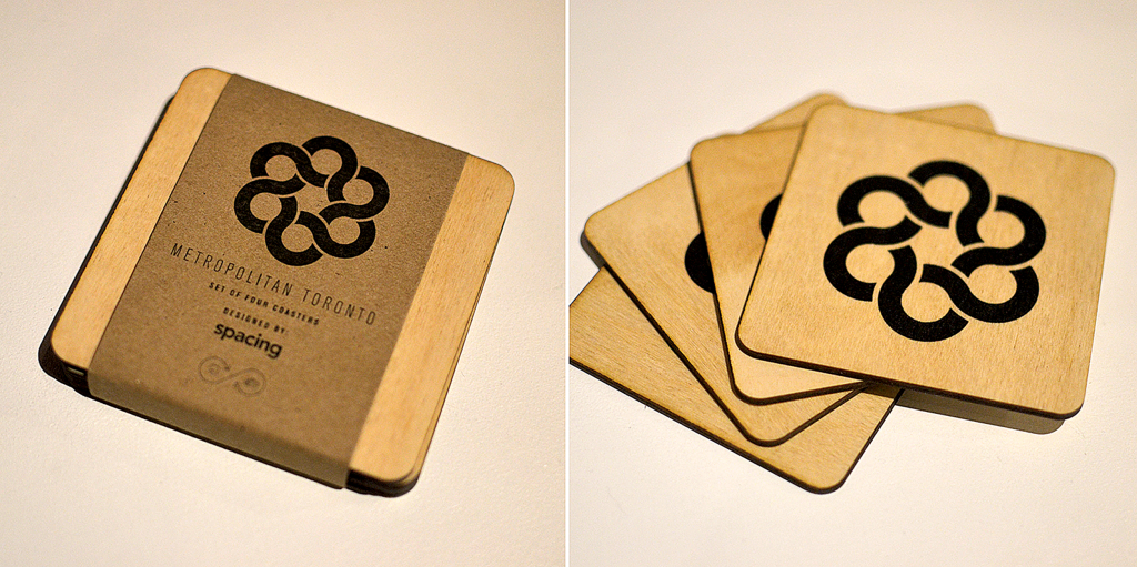
ABOVE: The former Metro Toronto logo screen-printed on to wood coasters.
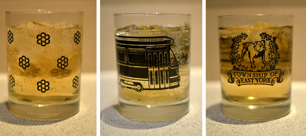
BELOW: Tumbler glasses display vintage icons of Toronto: the Metro logo (left), a streetcar (centre), and the old East York logo (right).
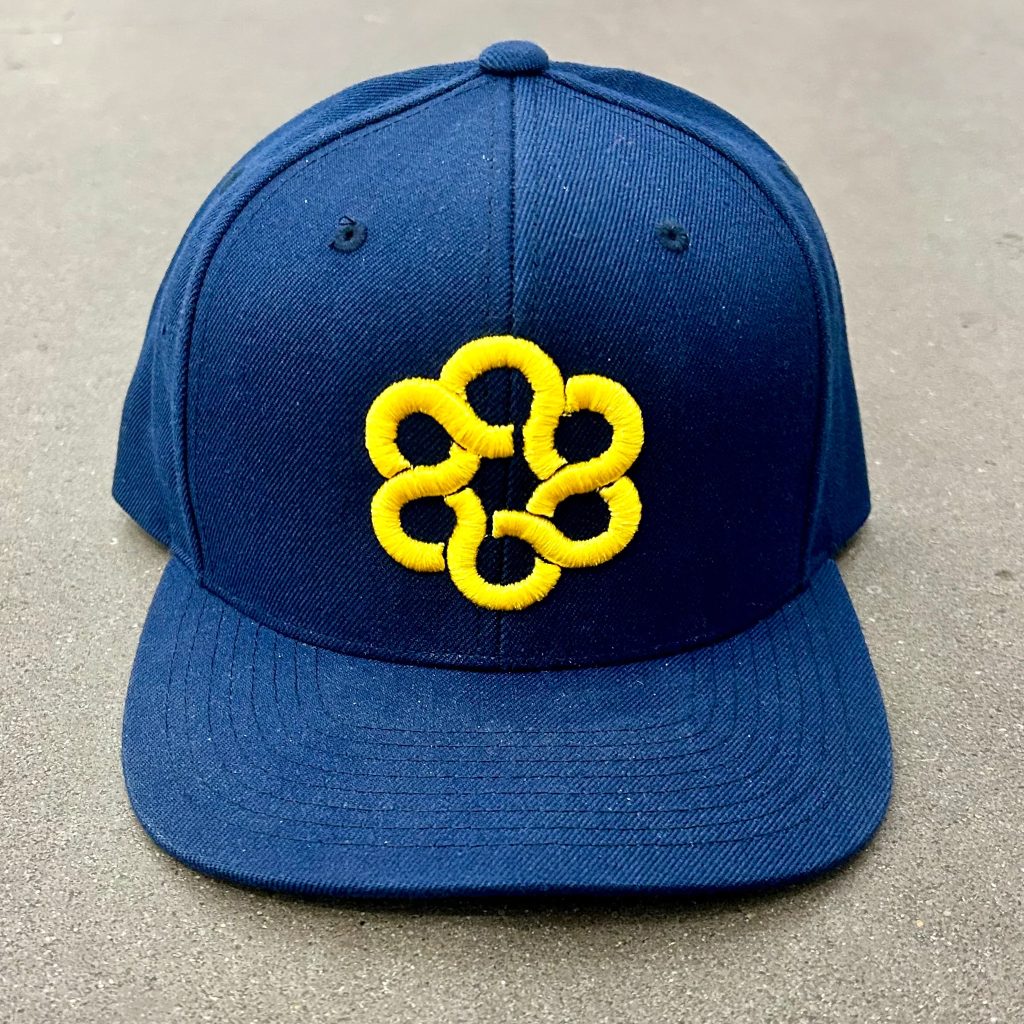
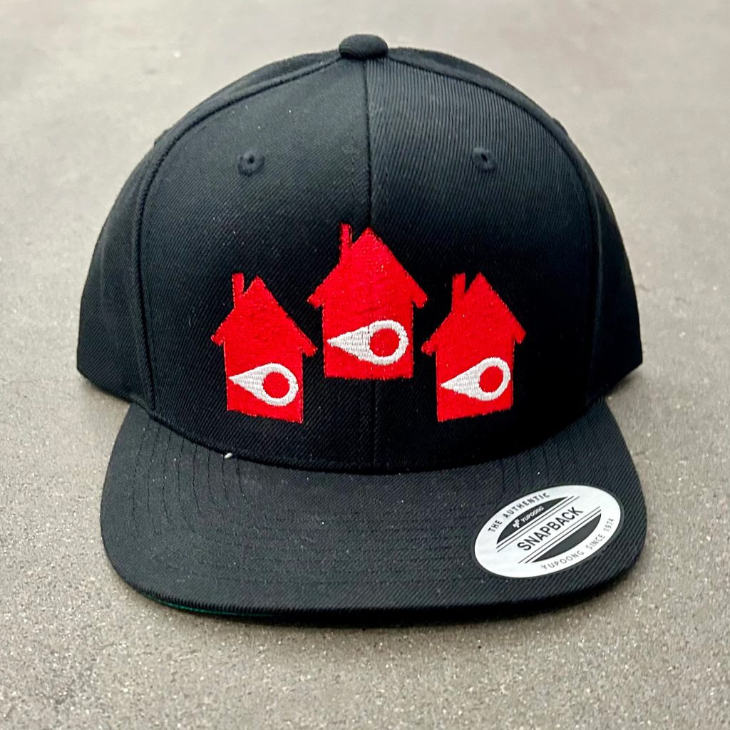
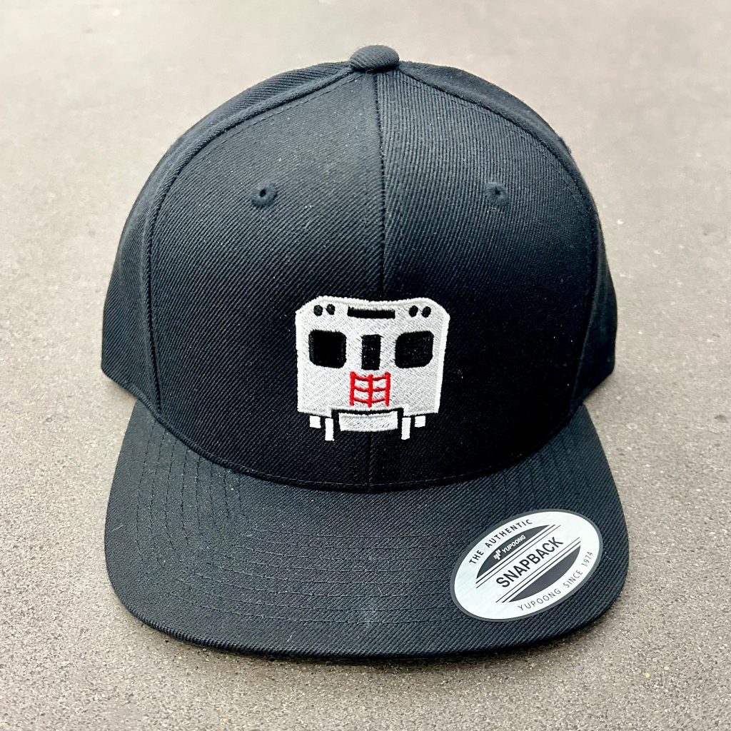
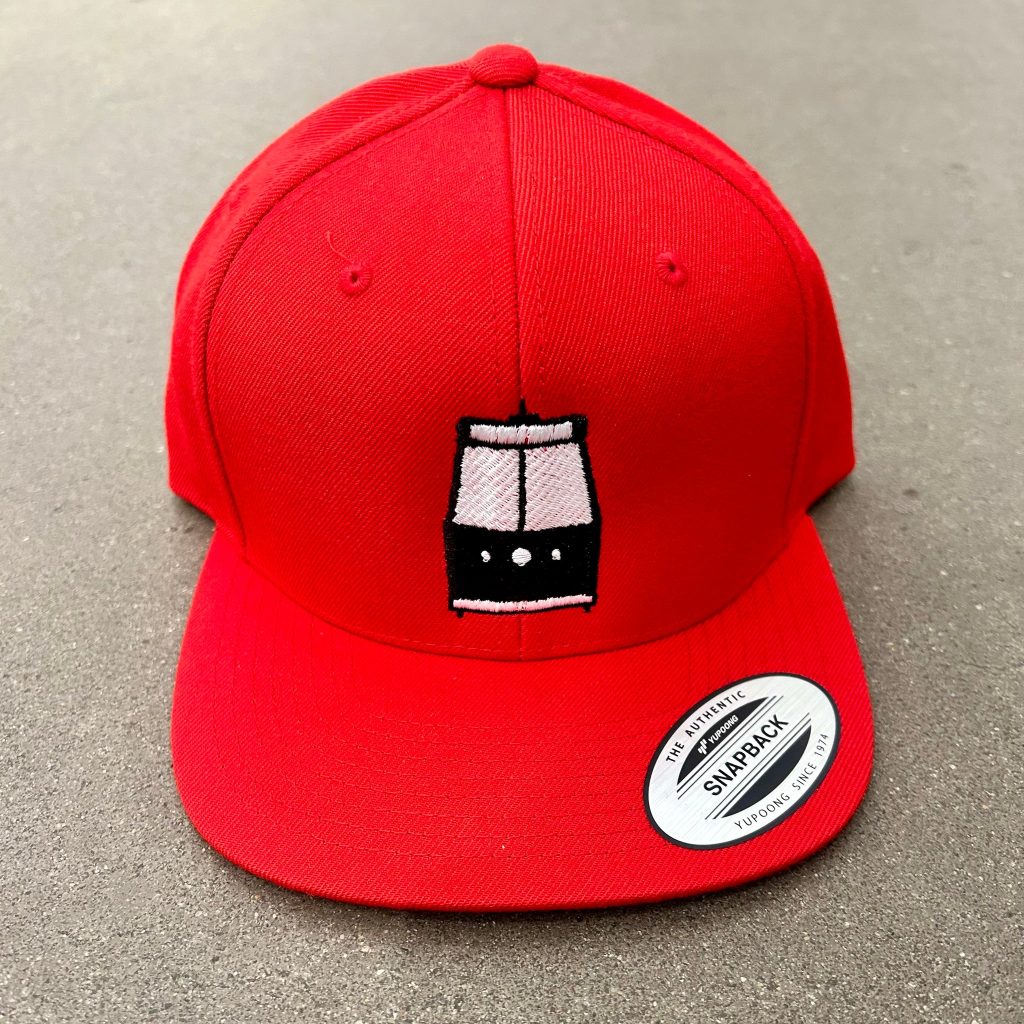
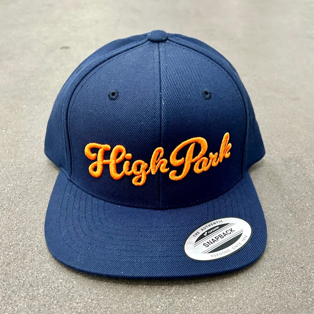
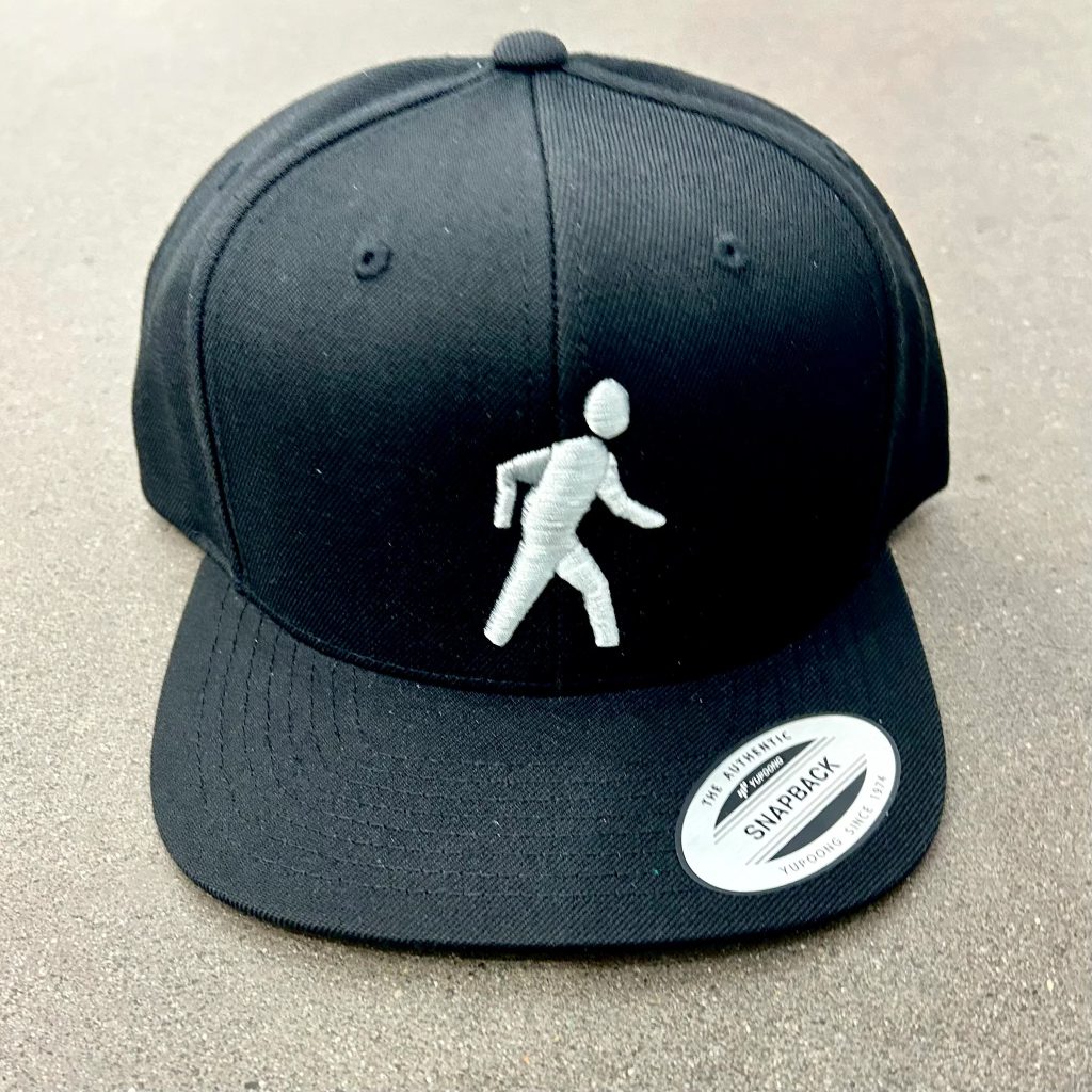
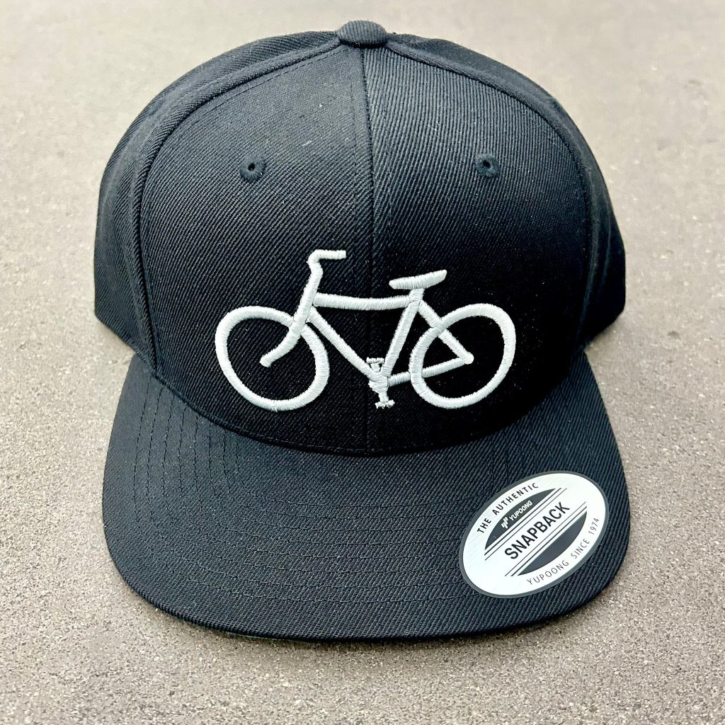
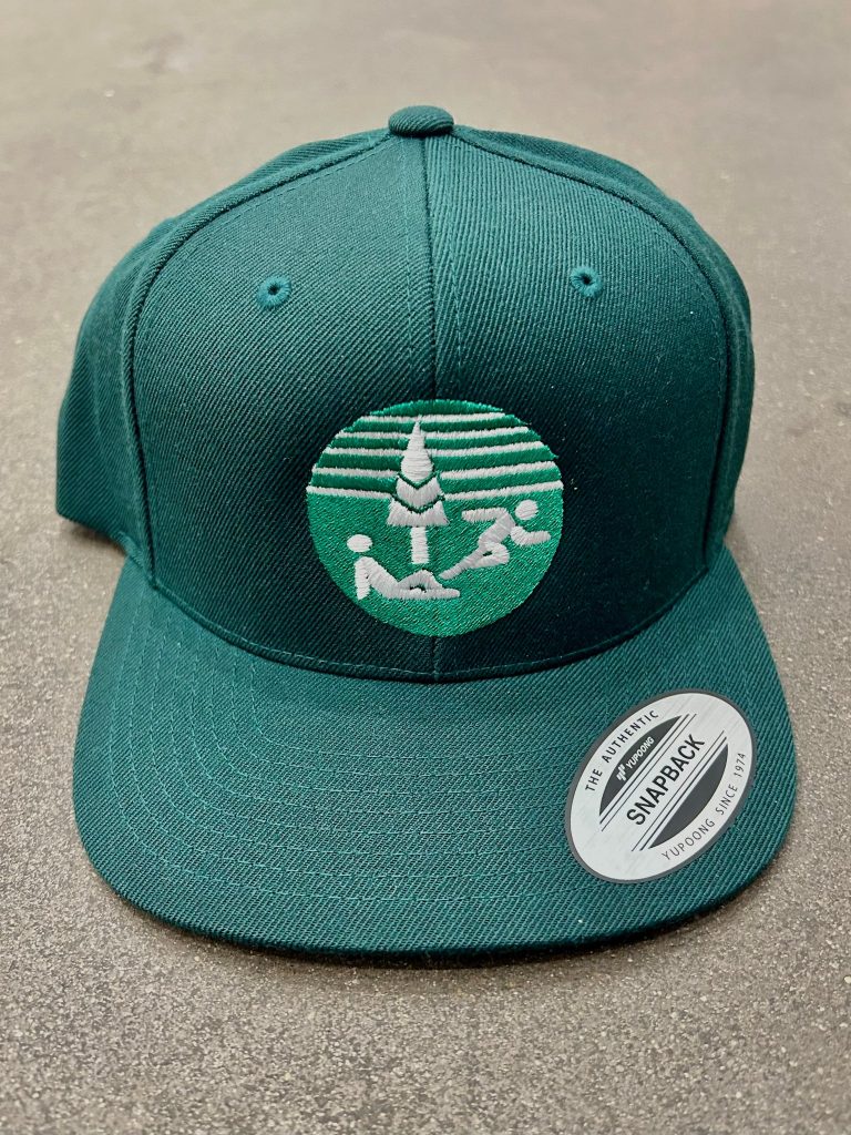
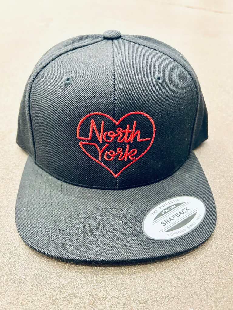
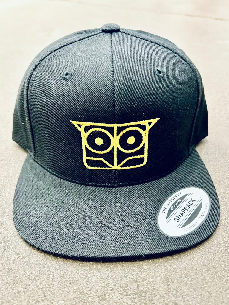
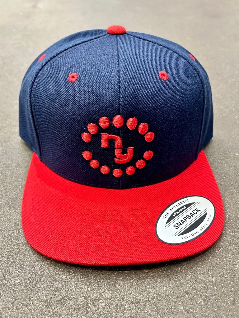
APPAREL
Matthew has created a line of hats for the Spacing Store using local iconography.