
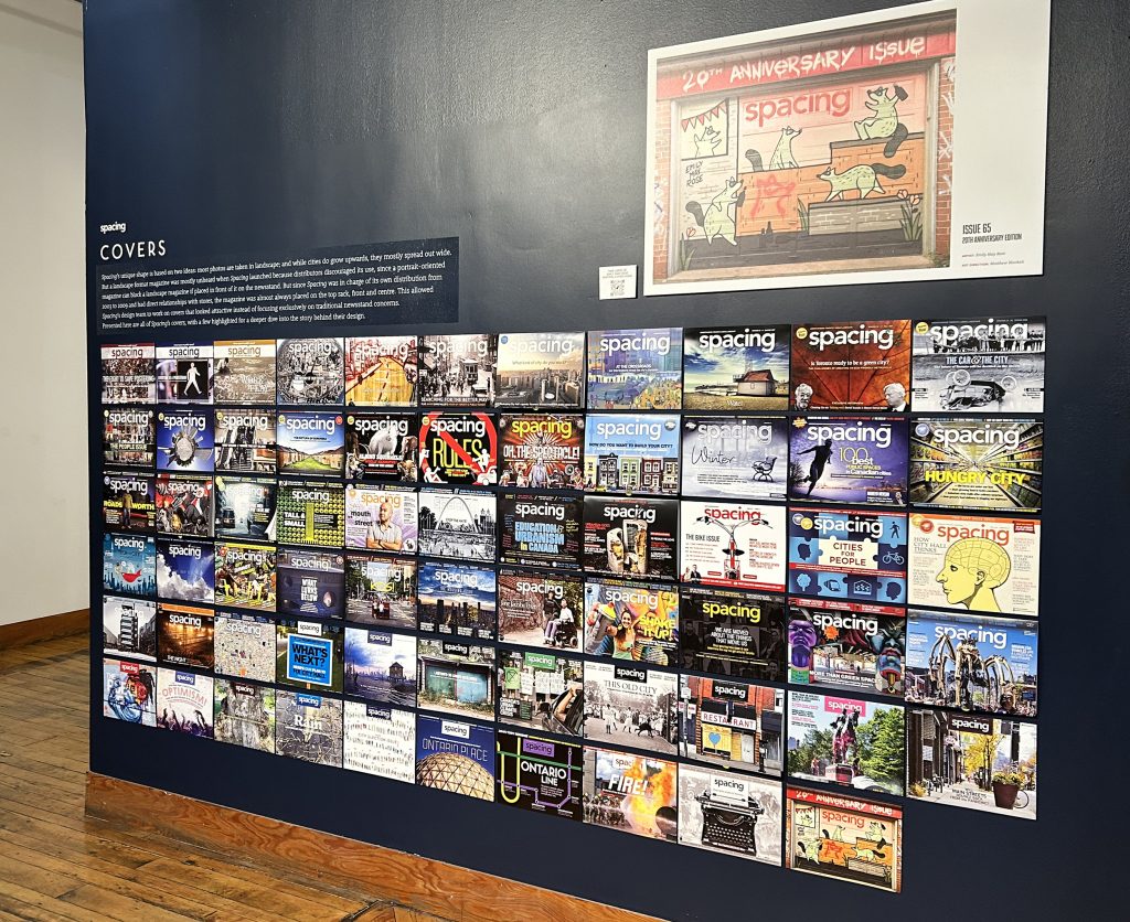
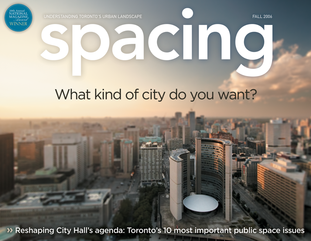
The cover of a magazine tells a story of what’s inside, but there are lots of stories that go into making a cover
The first seven years of my publishing career were spent as an art director designing sports magazines, with the final two specifically dedicated to working on covers for the company’s various annual sports fantasy-league guidebooks. I even went to “newsstand school,” where I learned about the type of words to use in headlines, which colours popped off the newsstand, and a variety of other distributor mumbo-jumbo. By the end of my time at the company, I had worked on over 350 covers. After I lost that job (kids, take note: show up to work on time…) I began to work on the design of Spacing. I took what I had learned in the corporate world and threw it out the window. Or more precisely, I modified it for my own vision of a small-scale and independent publishing company.
I landed on a landscape format for Spacing based on two ideas: photos are mostly taken in landscape and display better when printed large; and while cities grow upwards, they mostly spread out wide, so I wanted the magazine to replicate that feel. But a landscape format magazine was mostly unheard of at the time of our release. Why? Because distributors discouraged it since a portrait-oriented magazine can block the entire cover of a landscape magazine if placed in front of it on the newsstand. And a publisher has to pay to be at the top and front of a newsstand. But since Spacing was in charge of our own distribution for the first few years and had direct relationships with the stores carrying us, our magazine was almost always on the top rack, front and centre, allowing me to concentrate on creating cover designs that looked attractive instead of focusing on more traditional newsstand considerations.
MY FAVOURITE COVERS
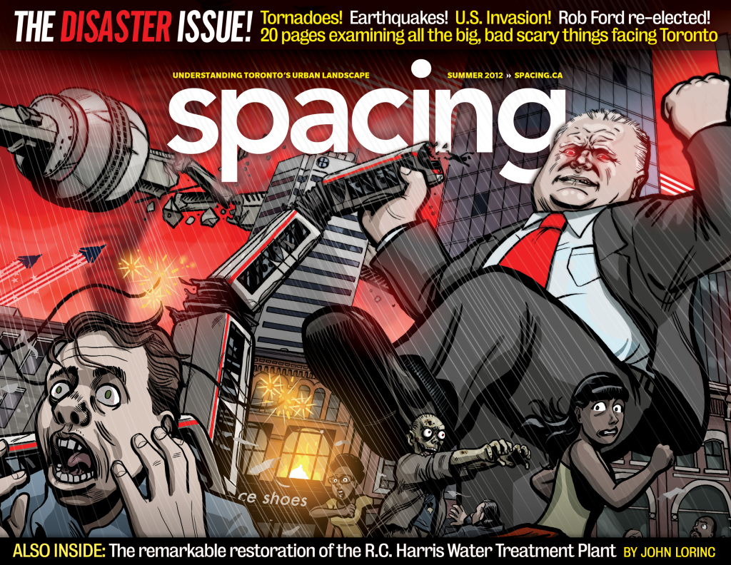
Disaster issue, #24, 2012
Rob Ford’s election in 2010 was a spiritual blow to Spacing after seven years of Toronto under David Miller’s leadership. As we prepared for our summer edition in 2012, we had to be nimble with the choice of content we would promote on the cover. The previous three issues saw us scrambling to edit articles and headlines days before going to press due either to Ford’s erratic antics or his on-the-fly policy decisions. The best way to alleviate this concern was to just assume he would do something ridiculous, so we worked him directly into the theme of our cover, focused on disasters hitting Toronto. I reached out to local graphic artist Steve Murray (pen name Chip Zdarsky) because my vision for the cover felt comic-inspired, like Godzilla rampaging through the city’s streets. Having designed every cover of the magazine in its existence, I can honestly say that I have not experienced more elation upon opening a downloaded file and seeing the final illustration than for this one. We sold over 250 prints of this cover at the release party for this issue. Murray has moved on to bigger things, winning multiple Eisner Awards for his comic work, writing a number of Spider-Man comic series (Marvel), leading the new Daredevil comic (Marvel), and launching a Batman anthology (DC Comics).
illustrator: Steve Murray
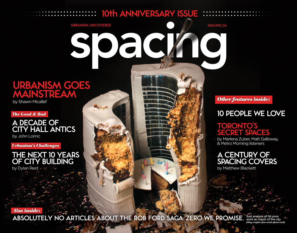
10th anniversary issue, #30, 2013
Concept covers are often hard to pull off, and our 10th anniversary issue was no exception. When baking artist Sarah Fortunato revealed her cake design to us at her shop, our staff jumped around with excitement. It looked so realistic and reached almost three feet in height. We lit the candles, threw down sprinkles, and thought we’d hit the jackpot with this cover. But after the studio photography was complete and I began to place the photos into the cover template, the concept wasn’t working for me. As an afterthought, we had captured some images of the cake half-eaten by our staff. So when I found myself frustrated with the direction of the cover and looking for new ideas, I dropped in the partially devoured cake photos on a lark. And behold, the cover for the issue was discovered. Some of the best graphic design work comes from a combination of being prepared (i.e. taking extra photos) and being open to modifying your original idea. It remains at the top of my list of Spacing design highlights.
photo: Bouke Salverda
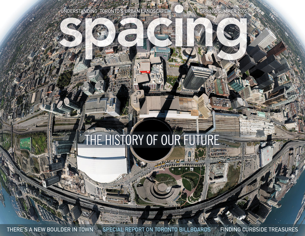
History of our Future issue, #4, 2005
This cover was our first to explore the new possibilities of digital photography. We discovered the image by Stephen Rothlisberger on the photo-sharing site Flickr. While on vacation in Toronto, the New Zealander took 54 photos from the viewing deck of the CN Tower and combined them in Photoshop to create a 360-degree panorama. The cover won our first National Magazine Award in 2006.
photo: Stephen Rothlisberger
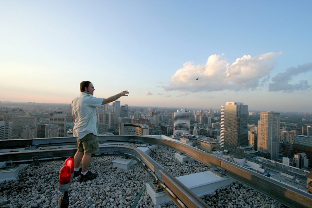
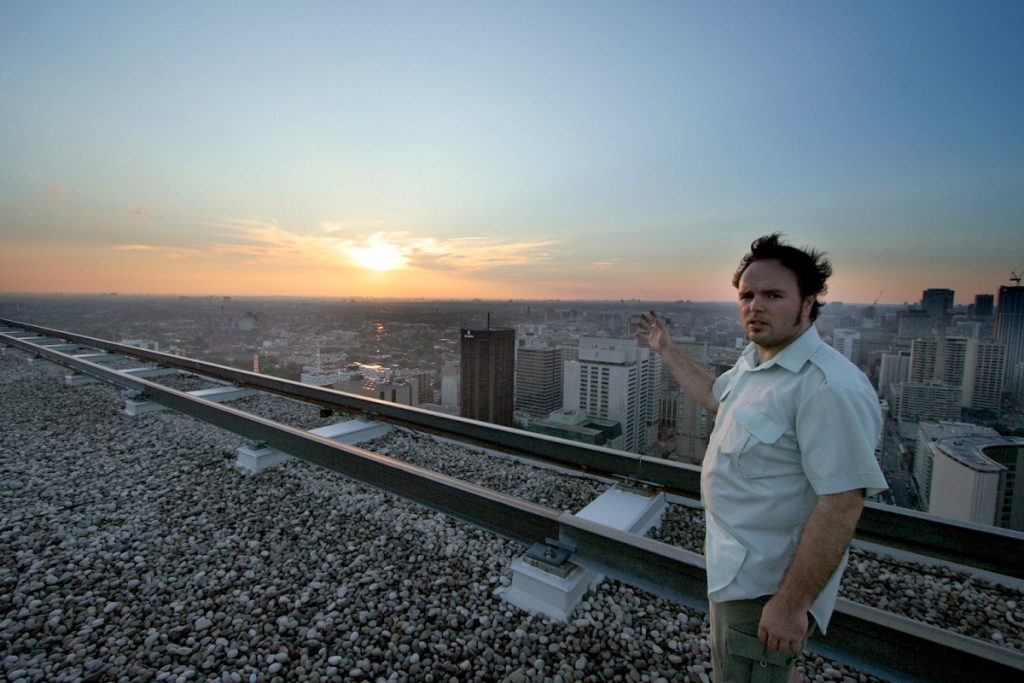
Election issue, #7 2006
I worked with local photoblogger Sam Javanrouh on this cover, the beginning of a long relationship between him and the magazine. Sam and I were granted access to the roof of the Sheraton Hotel to take photos of Toronto City Hall. The security guard who escorted us up to the roof was extremely scared of heights and told us to “just come tell me when you’re done.” We proceeded to stay up there for three hours and captured hundreds of other photos of downtown buildings from this unique vantage point. That’s me throwing a paper airplane over the side. Sam added the tilt-shift effect in post-production.
photo: Sam Javanrouh
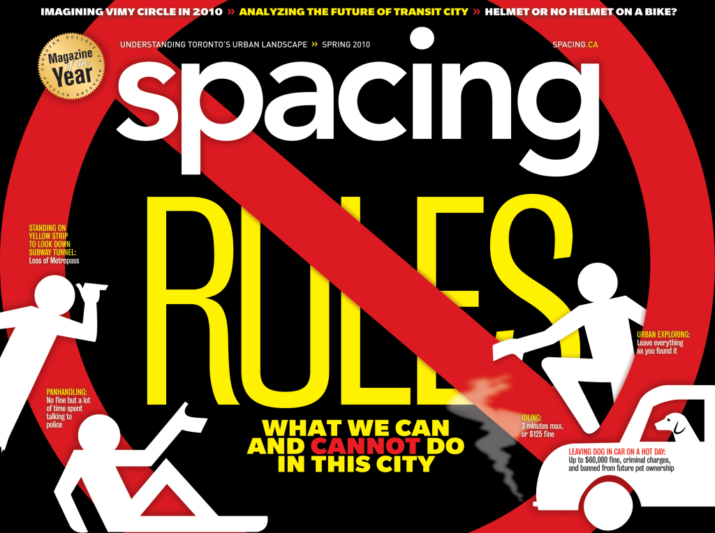
The Rules issue, #17, 2010
Despite my desire to buck traditional magazine cover design trends, I was pleased with the results of the Rules issue as it hit on the main question any distributor asks: does it stand out on the newsstand? I got the answer myself one day while riding the Queen streetcar — while stopped in traffic in front of Book City, I looked out the window and could see Spacing on the magazine rack inside the store, at least 40 feet away, with the words RULES in yellow popping out. I also love the double-entendre that the cover design creates: Spacing does not rule. I asked illustrator Marc Ngui to create individual icons in poses that allowed me to play with the layout in Photoshop.
illustrator: Marc Ngui
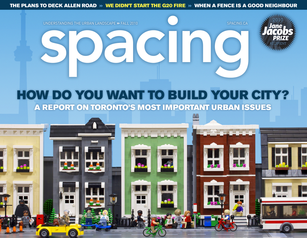
Election issue, #19, 2010
I began following a handful of Lego artists on Flickr around 2008 as I was totally smitten by their charm, humour, and creativity. One artist who stood out was Chris McVeigh, who was based in Halifax. I commissioned him to create a Toronto street scene out of Lego for our election issue and the theme of “How do you want to build your city?” Chris would eventually be hired directly by Lego in 2019 and has designed numerous products for the company (Brick Sketches, Elf Club House, Santa’s Visit). The cover was a finalist for a National Magazine Award in 2011.
photo & lego: Chris McVeigh
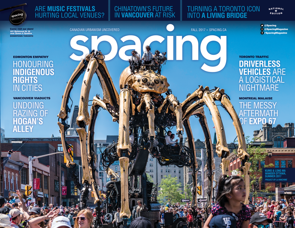
National issue, #44, 2017
Giant mechanical spiders roaming downtown streets in the country’s capital seem like the farfetched plot line of a bad sci-fi movie, but it was the reality for Ottawa residents in the summer of 2017. But what makes this cover special? Ottawa’s mayor at the time, Jim Watson, was defending the cost of the La Machine event during a press conference on live television when he held up and pointed to this cover and proclaimed, “this is the reason why we brought the spiders to the capital region. Spacing gets it, so should you.” The cover was a finalist for a National Magazine Award in 2018.
photo: Andre Vandal
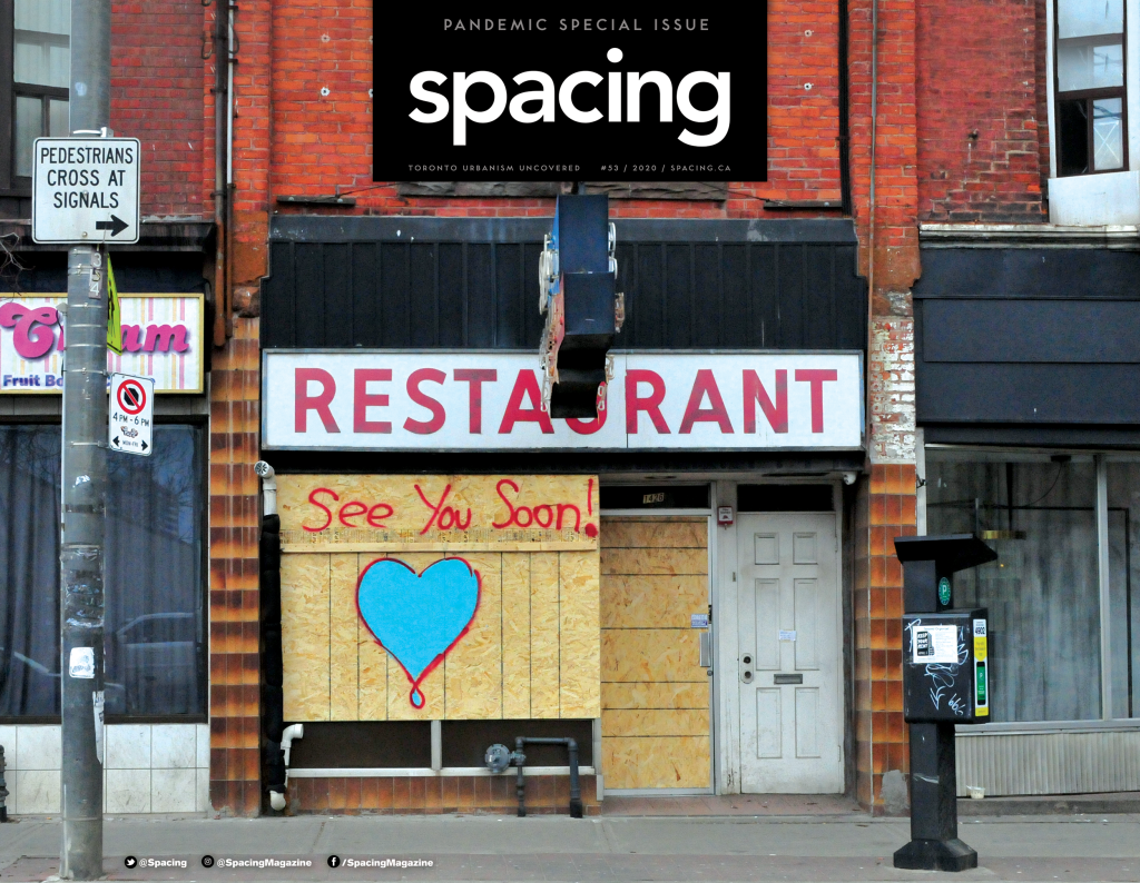
The Pandemic issue, # 54, 2020
We were set to go to press with another issue when the pandemic took hold in March 2020. We shifted gears about one week into the lockdown, and this issue was produced over the following week, with the special issue coming out in mid-April. Our designer, Julie Fish, captured the essence of the time with this image of the Skyline restaurant on Queen St. W. in Parkdale. Fittingly, it was the only cover in the magazine’s history without any headlines or captions (the 20th anniversary cover joined the club). The cover was a finalist for a National Magazine Award in 2022.
photo: Julie Fish
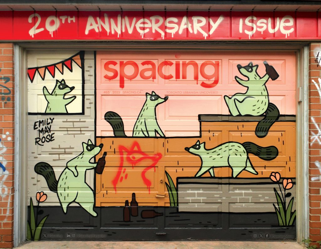
The 20th anniversary issue
When planning began for the 20th anniversary issue, I knew the cover demanded something special in order to live up to the City Hall cake on the cover of our 10th anniversary edition. I decided to commission a garage door mural in a laneway to celebrate our roots of supporting urban artists and activating underused public spaces. We teamed up with Emily May Rose, a local artist best known for outdoor murals featuring a cast of recurring raccoon characters depicting humorous situations in the city. Her murals can be found all over the world, where she’s painted in street art festivals, artist residencies, and other commissions during her various travels (she also opened Northern Contemporary, a gallery based in the Roncesvalles neighbourhood, in 2016).
We asked Spacing subscribers to submit their garage doors for consideration for a free mural. With over 20 entries to select from, we landed on Joanne and Ted’s garage near Little Italy, where Emily worked her magic on a beautiful October weekend.
The flag of Spacing and the dripping paint effects were added in Photoshop afterwards — it allowed me to play with the size and placement of it, as well as the making the tagline info legible.
The cover was a finalist for a National Magazine Award in 2024.
artist: Emily May Rose
Watch the time-lapse of the cover being painted